The fastest, most reliable path to accurate color matching for cabinets is this: remove a full door or large drawer front, bring it to a professional paint tinting lab for spectrophotometer scanning, and request sprayed test panels in your intended sheen. If your cabinets have a transparent stain, heavy grain, or sun-faded finish, a pigment match will likely fall short — ordering a sample door from a refacing vendor like Tdm-thedoormaker gives you a guaranteed, uniform result to compare instead.
Both paths are worth understanding. The sections below walk you through the full workflow, the technology behind paint shop matching, and the practical decision points that determine which route is right for your kitchen.
Key Takeaways
Accurate cabinet color matching requires sprayed test panels tested in your kitchen across multiple lighting conditions, not chips or brush samples.
| Point | Details |
|---|---|
| Use sprayed panels, not chips | Request 6"–8" sprayed MDF panels from your paint shop; brush samples and chips don’t show true color or sheen. |
| Test across three time windows | Check panels at 8 AM, 12 PM, and 8 PM to catch how light temperature shifts the perceived color. |
| Spectrophotometer limits matter | Transparent stains, figured grain, and sun-faded finishes resist accurate pigment matching; plan for refinishing or replacement. |
| Prioritize backsplash and countertop | Pull your cabinet undertone from the countertop’s mineral flecks and let the backsplash set the overall color direction. |
| Tdm-thedoormaker for guaranteed results | When a paint match is unlikely to succeed, order a sample door from Tdm-thedoormaker to confirm color and finish before a full refacing order. |
Table of Contents
- How color matching cabinets works: a 3-step workflow you can start today
- How paint stores and spectrophotometers actually match your cabinet color
- How to test matched swatches correctly in your kitchen
- Practical prep and finish tips for a professional cabinet result
- Why some finishes resist color matching — and what to do about it
- How your kitchen’s fixed elements should guide your color choices
- Common mistakes DIYers make when matching and painting cabinets
- When should you repaint, refinish, or replace your cabinet doors?
- What installers and refacing pros want you to know
- Tdm-thedoormaker: a guaranteed uniform finish without the guesswork
- Sources
How color matching cabinets works: a 3-step workflow you can start today
You don’t need to guess or wait for a contractor. Here’s a compact process you can begin immediately.
-
Remove a full door or large drawer front. A sample the size of your palm won’t give a paint shop enough surface area to read accurately. If removing a door isn’t practical, order a sample door from a refacing vendor to use as a comparison reference. Note the finish type: solid paint, lacquer, stained veneer, or thermofoil. That detail determines what the shop can realistically reproduce.
-
Bring the sample to a professional paint shop and request sprayed test panels. Ask the technician to scan the door with a spectrophotometer and produce sprayed panels in your intended sheen (satin or semi-gloss), not brush-applied chips. Brush samples look different from sprayed finishes even when the formula is identical. If your finish is a transparent stain or a varnished veneer, tell the technician upfront — the limits of spectrophotometer matching matter here, and the shop should advise you accordingly.
-
Test the returned panels in three locations and at three times of day. Place them next to upper cabinets, lower cabinets, and your island (if you have one). Check at 8 AM, 12 PM, and 8 PM. Note how the color shifts under morning sun, midday overhead light, and evening artificial light. Track the Light Reflectance Value (LRV) of your match against the existing cabinets — a difference of more than a few LRV points will be visible in direct light.
Pro Tip: Photograph each swatch next to a sheet of pure white paper and a neutral gray card. The white paper forces any warm or cool undertone to reveal itself. A panel that looks perfectly neutral in isolation often shows a green or pink cast against true white.
How paint stores and spectrophotometers actually match your cabinet color
A spectrophotometer measures the spectral reflectance of a surface across the visible light spectrum, then generates a pigment formula that a tinting machine can reproduce. For solid, opaque cabinet paint, this process is genuinely accurate. The device reads the mass color of the surface and produces a formula your paint shop can mix on the spot.
The limits appear quickly, though. Spectrophotometer matches are powerful for pigment-based paints but often produce inaccurate results on transparent or variegated stained wood because the device reads surface reflections rather than the depth of stain penetration. If your cabinets are a medium-brown stained oak with visible grain, the scanner reads the average color of the surface, not the layered interaction between wood fiber, stain, and topcoat. The resulting formula will produce a flat, opaque paint that looks like the right color from across the room and wrong up close.
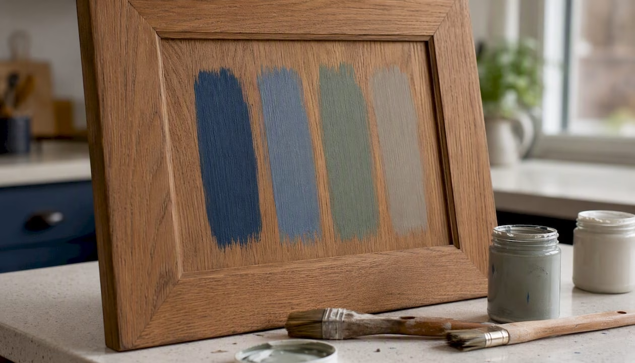
Sun-faded panels create a different problem. A door that has been bleached by years of direct sunlight will read differently from a door inside a closed cabinet. Matching the faded door produces a formula that won’t match the protected doors — and matching the protected doors leaves the faded one visibly off. Sheen compounds the issue further: a semi-gloss formula applied with a brush reads differently from the same formula sprayed, because brush marks scatter light and reduce apparent sheen.
Pro Tip: When you request test panels, specify the exact sheen you’ll use on the final cabinets — satin, semi-gloss, or eggshell. A panel sprayed in satin and a panel sprayed in semi-gloss from the same formula will look like two different colors under kitchen lighting.
How to test matched swatches correctly in your kitchen
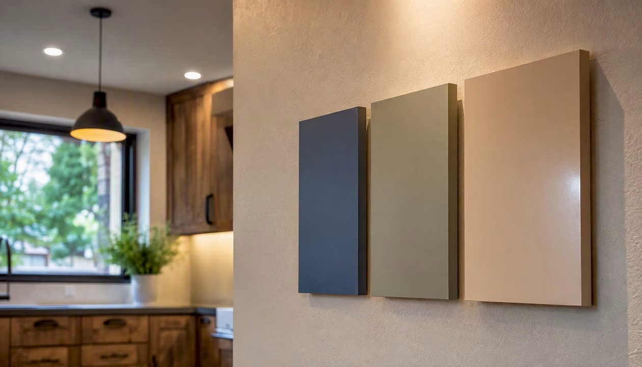
Small paint chips rarely reveal undertones accurately; designers recommend sprayed test panels or large-format samples to evaluate color in place. Request sprayed 6"–8" panels on primed MDF boards from your paint shop, or use pre-sprayed sample doors from your refacing vendor. The larger the sample, the more accurately you’ll read the undertone and sheen.
Once you have your panels, follow this sequence:
- Attach panels directly next to your upper cabinets, lower cabinets, and island. Don’t test them on a wall or countertop — the surrounding surfaces change how the color reads.
- Check the panels at 8 AM, 12 PM, and 8 PM. Professional painters stress that the same paint reads differently under varying lighting, and morning sun coming through an east-facing window can make a warm white look golden while the same paint looks clean and cool under overhead LEDs at noon.
- View the panels under every artificial light source you use daily: recessed LEDs, under-cabinet strips, and pendant lights. Warm-white bulbs (2700K) amplify yellow and beige undertones; cool-white bulbs (4000K–5000K) push colors toward gray and blue.
Photograph the swatches next to your backsplash tile and on top of a sheet of white paper. The backsplash photo shows whether the undertones harmonize with your tile grout and glaze. The white-paper photo reveals any hidden cast in the panel color that you’d otherwise miss until the paint is already on the doors.
Document your window orientation and bulb color temperature before making a final decision. A kitchen with south-facing windows and warm 2700K pendants behaves very differently from a north-facing kitchen with cool 4000K recessed lights, even with the same paint formula on the doors.
Practical prep and finish tips for a professional cabinet result
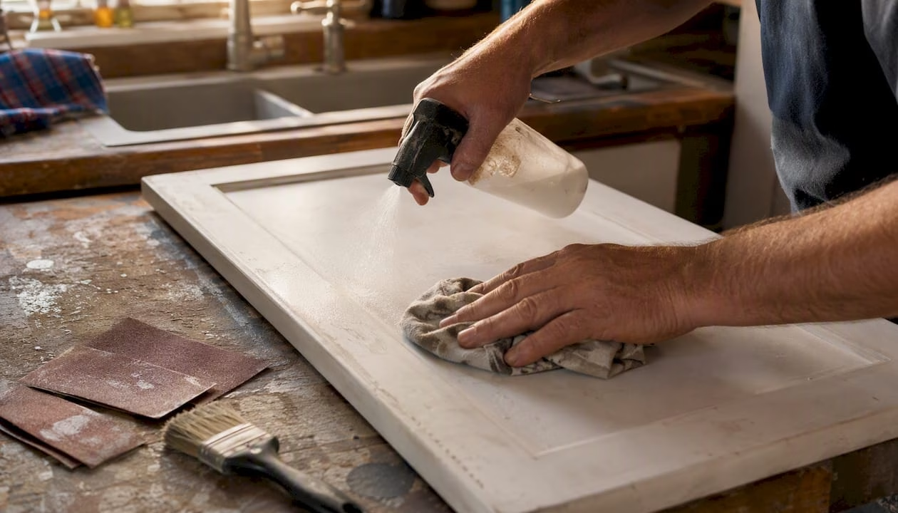
Surface preparation determines whether a matched color holds up or starts peeling within a year. Clean every cabinet surface with a degreaser — TSP substitute or a dedicated cabinet cleaner works well — then sand lightly with 150-grit to give the primer something to grip. Skip this step and even the best-matched paint will lift at the edges within months.
Primer selection depends on your existing finish. For previously painted cabinets in good condition, a waterborne alkyd primer bonds well and dries fast. For glossy lacquer or thermofoil surfaces, a shellac-based primer like Zinsser BIN creates the adhesion that latex primers can’t achieve on their own. Stained or bare wood benefits from an oil-based or shellac primer to seal tannins and prevent bleed-through that would shift your matched color.
For topcoats, practical painting tips from experienced renovators consistently point to quality primer, light sanding between coats, and spraying where possible for an even, durable finish. Waterborne alkyds (Benjamin Moore Advance, Sherwin-Williams Emerald Urethane) level well and cure to a hard, washable surface. Sheen-wise, soft satin (30–40 sheen) reads cleanest on flat-panel doors; semi-gloss (50–60 sheen) suits raised-panel profiles and high-traffic kitchens where wipe-down durability matters more than subtlety.
Pro Tip: Before committing to the full cabinet run, paint the interior face of a removable drawer front or a hidden door panel as your final acceptance test. If the color, sheen, and texture look right there, proceed. If something is off, you’ve lost one panel, not an entire kitchen.
Why some finishes resist color matching — and what to do about it
Some cabinet finishes simply can’t be reproduced with a pigment-based paint match, no matter how good the spectrophotometer reading is. Recognizing these situations early saves you from a costly repaint that still looks wrong.
Situations where pigment matching typically falls short:
- Transparent or semi-transparent stains: The color comes from the interaction between stain and wood grain. A solid paint formula can approximate the average tone but loses the depth and variation that make stained wood look natural.
- Heavy grain variation: Figured oak, hickory, and knotty pine have such strong grain contrast that any solid color reads flat against them.
- Sun-bleached panels: Faded doors have a different base color than protected doors in the same run, making a single formula unable to match both.
- Multi-layer varnish or lacquer: The sheen and depth of a built-up lacquer finish can’t be replicated with a single coat of matched paint.
When the color difference comes from transparency or depth rather than surface pigment, you have three practical options. Full spray refinishing by a professional, using color-correcting toners and a compatible topcoat, can restore a stained finish if the wood is in good condition. Replacing or refacing the doors with custom cabinet doors gives you a guaranteed, uniform color across every door in the run. A two-tone strategy — accepting that upper and lower cabinets will differ and leaning into the contrast deliberately — is a third path that many designers now recommend when fixed elements make a single-color match impractical.
For guidance on refacing materials and finishes that hold color consistently over time, the material choice matters as much as the color formula.
How your kitchen’s fixed elements should guide your color choices
The backsplash often dictates cabinet color more than any other element, because it’s vertical, visually prominent, and usually the most complex surface in the kitchen. Start there, then work outward.
A practical priority order for choosing cabinet colors that harmonize with your kitchen:
- Backsplash — the dominant vertical surface that sets the undertone range
- Countertop — the horizontal surface you see most; pulling a cabinet color from the mineral flecks in your countertop avoids undertone clashes that make stone look dingy
- Flooring — warm wood floors push you toward warm cabinet undertones; cool gray tile gives you more flexibility
- Appliances and hardware — stainless reads cooler; brass and bronze read warmer
- Personal preference — color you genuinely want to live with daily
LRV (Light Reflectance Value) gives you a measurable way to control contrast. Aim for roughly 20 LRV points of difference between your cabinet color and your walls when you want a clear but not jarring contrast. Lighter cabinets (LRV 70+) open up smaller kitchens visually; darker cabinets (LRV below 30) add weight and drama but require good lighting to avoid a closed-in feel.
When fixed elements mix warm and cool undertones, designers often recommend a bridge greige or a two-tone approach — for example, a warm-white perimeter paired with a slightly cooler island — to prevent one surface from making another look dingy. That proportion means your cabinet color sets the entire kitchen’s temperature, so undertone accuracy matters more than the specific color name.
Pro Tip: Hold a sheet of white paper against your countertop in natural light. The countertop’s undertone will become immediately visible against the neutral white. If the stone reads warm (beige, gold, pink), choose a cabinet paint with a warm undertone. If it reads cool (gray, blue, green), stay on the cool side of the palette.
For current color directions worth considering, the National Kitchen & Bath Association (NKBA) publishes annual trend data that reflects what professional designers are specifying across North American kitchens.
Common mistakes DIYers make when matching and painting cabinets
Most color-matching problems are preventable. The errors below account for the majority of repaints and touch-up calls.
- Choosing from a photo or a tiny chip. Screen colors are calibrated to the monitor, not your kitchen. A 1"×2" chip can’t show you undertone or sheen at cabinet scale.
- Ignoring sheen differences. A satin formula looks noticeably different from a semi-gloss formula even when the color is identical. Always match sheen, not just color.
- Accepting a brush-applied sample as proof. Brush marks change how light hits the surface. A sprayed panel is the only valid proof of what the formula will look like on your doors.
- Trusting a color number without a sprayed test. Paint color codes are formulas, not guarantees. The same code mixed at two different shops can produce slightly different results depending on the tinting machine and pigment batch.
- Testing only once, in one location. A color that looks right at noon under overhead lights can look completely different at 8 PM under warm pendants. Test across all three time windows before approving.
- Skipping the undertone check. Subtle differences between whites can cause backsplash or countertops to look yellow or dingy when the undertones conflict. The white-paper test takes 30 seconds and prevents this.
For oak or warm-wood kitchens specifically, avoiding pure whites in favor of warmer off-whites is a common professional recommendation — pure white against warm grain often reads stark and cold rather than clean.
When should you repaint, refinish, or replace your cabinet doors?
The right choice depends on four factors: the quality of match you need, the condition of your existing doors, your budget, and how much time you have.
| Option | Match accuracy | Typical turnaround | Best for |
|---|---|---|---|
| DIY repaint | Moderate | 2–5 days | Sound doors, solid paint finish, budget-conscious |
| Pro spray refinish | High (solid colors) | 3 days | Good-condition doors, solid or lacquer finish |
| Custom replacement/refacing | Guaranteed uniform | 1–3 weeks (order + install) | Stained/varnished doors, worn surfaces, or when exact match is impractical |
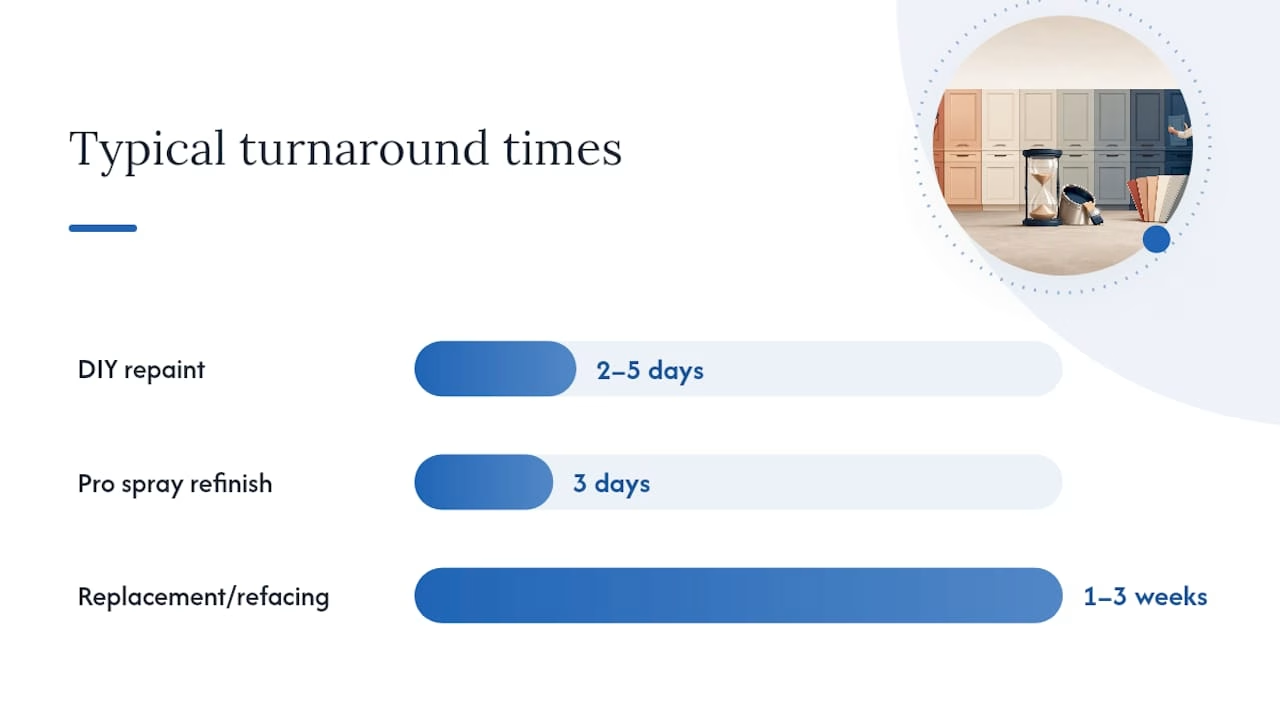
Repainting makes sense when your doors are structurally sound, the existing finish is a solid paint or lacquer, and the color difference is small enough that a spectrophotometer match will get you close. Professional spray refinishing raises the accuracy ceiling for solid colors but still can’t reproduce transparent stain depth.
Replacement or refacing becomes the more cost-effective path when you’ve already done two or more touch-up rounds, when the doors show physical wear (delamination, swelling, deep scratches), or when the original finish is a stain or veneer that no pigment formula can replicate. At that point, repeated refinishing costs often exceed the price of a full door replacement, and the result is still a compromise. A comparison of cabinet refacing versus a full remodel shows that refacing typically delivers the visual result of new cabinetry at a fraction of the cost.
What installers and refacing pros want you to know
The gap between a color match that looks right in the paint shop and one that holds up in a real kitchen comes down to three things installers see repeatedly: sprayed panels, consistent sheen across every door in the run, and controlled conditions during application.
Temperature and humidity affect how paint levels and cures. That texture difference changes how the color reads under light, even when the formula is correct.
The most practical advice from experienced installers: when you’re uncertain about a match, test a single removable drawer front before touching the rest of the kitchen. A drawer front is easy to remove, easy to repaint if the result is wrong, and gives you a full-size, in-context proof of the finished look. If you’re considering replacement doors, order one sample door first and hold it against your existing cabinetry in your kitchen, under your lights, at different times of day. That single test eliminates most of the uncertainty before you commit to a full order.
Tdm-thedoormaker: a guaranteed uniform finish without the guesswork
When spectrophotometer matching isn’t going to reproduce your stain depth or grain variation, Tdm-thedoormaker offers a direct path to a uniform, professional finish. Instead of approximating an existing color, you choose from 130+ colors and finishes, order a sample door or swatch set, and compare it directly against your existing cabinetry in your own kitchen before placing a full order.

The ordering process runs through an online configurator: measure your existing doors, select your style and finish, and place the order with sizing precise to 1/10,000". Sample doors are available so you can confirm color, sheen, and texture in your actual kitchen before committing. For kitchens where the original finish is a stain, veneer, or aged lacquer that no paint shop can reliably reproduce, this approach removes the uncertainty entirely. You can also browse the full cabinet color archive to narrow your selection before ordering a physical sample.
To get started, order a sample door or swatch set and test it in your kitchen before committing to a full project.
Sources
The following sources informed this guide and offer deeper technical or design guidance for specific aspects of cabinet color matching and finishing.
Design guidance:
- Painting kitchen cabinets: how to pick the best paint colour (Kylie M Interiors)
- Best Cabinet Paint Colors: And How to Choose the Right One (Z & Co Design Group)
- Color Matching Our Kitchen Cabinets (+Painting Tips) (Room for Tuesday)
- National Kitchen & Bath Association (NKBA)
Technical and method guidance: